Responsive user interface
Many Platform components use responsive user interface design. This means they adapt to a variety of screen widths, either by resizing (such as images) or by reorganizing (such as in a View or Edit page with multiple columns). Responsive components improve the user experience on applications that are viewed on a variety of devices.
Responsive features include:
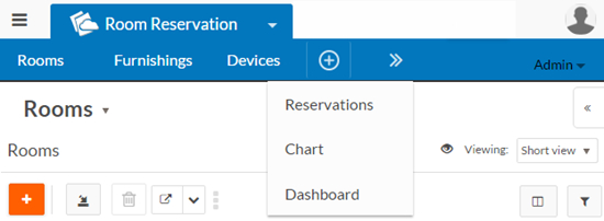
- Responsive application menu bar with overflow. If the screen width is too
narrow to display all tabs, the rightmost tab(s) move into an overflow menu:
- Vertical and horizontal responsive design modes for pages with multiple columns (except Record List pages). These modes define how multiple columns are displayed on different screen widths. Vertical responsive design is the default. See Vertical and horizontal responsive design for details.
- Responsive dashboard pages. See Responsive dashboard pages for details.
- Responsive page title and toolbar. See Responsive page title and toolbar for details.
- Responsive images
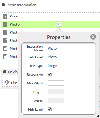
Image fields are responsive by default. You can control responsiveness and maximum size for an image by setting properties in the page editor for the image field. If the Responsive property is selected (the default), you can set the Max Width property to control the maximum width of the image. The Responsive property only affects desktop devices; images on mobile devices are always responsive. To make an image non-responsive, deselect the Responsive property.
- Responsive image carousels
To control the carousel's space consumption, you can specify a maximum width for the carousel in the page editor by setting the Max Width property (in pixels) for the first image field. A carousel is responsive to the cell in which it is rendered on the page, keeping the proportions of the image. It is responsive even if the images are not responsive. For more information about image carousels, see Image Upload field.
- Responsive charts
Charts are responsive and are auto-scaled to fit the available space. Auto-scaling is done only if the available space is less than the configured chart dimensions. Otherwise, the chart will always be rendered with the configured dimensions. To enable responsive charts, the chart property Fit to Container Size must be selected (selected by default). See Creating charts for more information.