Creating charts
You create charts from an object definition page. To build or configure a chart:
- Navigate to an object definition page, select Charts from the ribbon, and click New Chart.
The New Chart page opens:
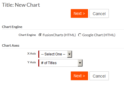
- Select one of the chart engines, either FusionCharts (HTML) or Google Charts (HTML).
- Designate how records of a particular object will be grouped into collections
(columns or slices). A set of collections is referred to as the X
Axis (this refers to a bar-style charts and can be logically
extended to other types of charts). You can create these groupings for:
Records of the object typeEnumeration fields (pick lists, status)Lookup fields (one or more related records)Date fields (dates can be further grouped by week, month, quarter, or year)Numeric fields (allows specification of a range of numeric values)
- Specify which numeric value will be summarized for each collection. This value is referred as the Y Axis. This value might belong to either the parent or to a related object. You can also use the count of parent or of related records.
- Click Next and specify the following
information:
The chart styleA name for the chartLabels for the X-Axis and Y-Axis (not used for pie and donuts charts)The chart width and height in pixelsFit to Container Size — When selected (the default), the chart is responsive and is auto-scaled to fit in the available space. Auto-scaling is done only if the available space is less than the configured chart dimensions. Otherwise, the chart will always be rendered with the configured dimensions. Deselect this property to disable responsiveness for the chart.
- Optionally specify the following if you selected FusionCharts as your chart engine:
Select Chart Background if you want this chart to have a background color or image. If you choose to have an external image (GIF, JPEG or PNG only) as a background of the chart, you must browse and upload an image. You can then select the required Background Opacity and Display Mode.Select Chart Font Color if you want to change the chart's default font color. You must ensure you choose a contrast font color that will be clearly visible on the chosen chart background color.Select Canvas Background Color if you want to add a background color to the chart canvas. In addition, you can also set the canvas color opacity.Note: The Canvas Background Color property is not available for Doughnut (2D and 3D), Pie (2D and 3D), and Grid charts.Select Animate Chart if you want HTML-based animation for this chart when available.Select Auto-Refresh Chart if you want this chart to be automatically refreshed without manually reloading the page or report where the chart resides.Select Disable Drill-Down if you do not want to allow drill-down to records in chart columns or pie slices.Select View for Drill-Down to specify the view to use to display the drill-down data.Select Show Chart Logo if you want to add a logo (GIF, JPEG or PNG only) to the chart. In addition, you can also set the logo scale, opacity, and position. You can also point the logo to some external url by providing the Logo Hyperlink.
- Specify the Chart Columns setting for
the selected collections:
For numeric fields, select the range and width of each collection.For date fields, select the date's interval (week, month, quarter, or year) range.In the Compute What field, specify what is to be computed for records that fall in a particular collection: total, average, or percentage of this collection relative to all collections total.In the Data value color property, specify the color for the data value. Note that this will work in conjunction to the Show Columns Values property. You can specify the color for the data values only if Show Columns Values property is selected.Note: The Data Value Color property is not available for Doughnut (2D and 3D) charts.In the Data plot fill type property, specify the data plot fill type (color/gradient) and you can choose to turn on/off the Show border for data plot.Note: The Data plot fill type property is not available for Column 3D, Doughnut (2D and 3D), Line, and Pie (2D and 3D) charts. While, the Show border for data plot property is not available for Line charts.Warning: To preserve system resources, the total number of collections per chart is limited to 200. If you select conditions that generate too many collections, not all collections will be displayed and Platform will generate a warning message. Hiding empty collections by checking the Hide empty columns check box will improve the visual representation of your chart but will not remove the limitation on the total number of displayed collections.
- Optionally use Chart Filters to filter and render different types of data on your chart.