Vertical and horizontal responsive design
Platform supports vertical responsive design as the default responsive mode. You can still select horizontal responsive design at the application level. See Editing applications for details.
Responsive design is geared towards providing optimal viewing of apps on a variety of devices. For a Platform application, you can design pages such as View, New, and Edit pages with multiple columns. Those columns are displayed differently on different device sizes. Vertical responsive design will cause columns to display differently from horizontal responsive design on smaller devices.
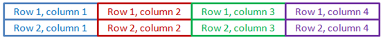
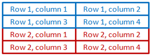
For example, if a page contains four columns, the columns display as shown below on a large device:
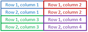
Using vertical responsive design on a medium device, the columns display as shown below:
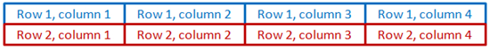
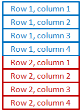
Using vertical responsive design on a small device, the columns display as shown below:

Using horizontal responsive design, the columns display as shown below on a large device:
Using horizontal responsive design on a medium device, the columns display as shown below:
Using horizontal responsive design on a small device, the columns display as shown below:
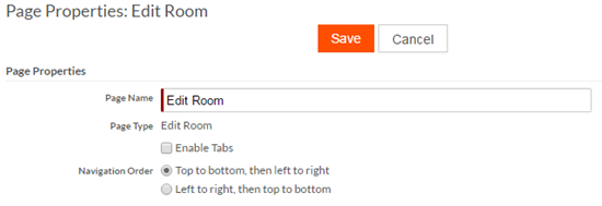
When using vertical responsive design, the recommended setting for Navigation Order (a page property) is Top to bottom, then left to right. Otherwise tab navigation through fields will not behave as the user expects on smaller screens. For horizontal responsive design, the recommended setting for Navigation Order is Left to right, then top to bottom to achieve the expected behavior.
To set the navigation order:
- Navigate to the object definition that includes the page for which you want to set the navigation order.
- Navigate to the Pages section.
- Click Properties on the page row.
- Select the desired Navigation Order: