Editing applications
The application setup page allows you to view and edit the following for an application:
- The application definition
- Application properties
- Application components - add new components or edit existing components
To open the application setup page and view or edit an application:
- From the application switcher drop-down available next to the application
name:
To navigate to settings for the current application, click App Settings.To navigate to settings for a different application, hover your mouse pointer over the application and click its associated Application Settings icon.
- Perform any of the following operations on the application
setup page:
Add or edit the application components (such as tabs or objects) listed in the box below the application name:

Click the component link to navigate to the component area. For example, click Tabs to navigate to a table listing the application's tabs.
Click Delete to delete an application. See Deleting an application for more information.Click the More actions... drop-down menu to perform advanced operations. See Application actions for the options available in this menu.Click the Theme Preview
icon to try out different themes for your application. See Using the Theme Preview mode for more information. Click Post Install Scripts to add one or more post install scripts to the application. See Post install scripts for details.Click Edit to view and edit application properties:
- Deployment
status specifies:
- Whether an application is deployed. If the application is deployed, all users with permissions to view the application will see it when they log in. If the application is not deployed, only users with permissions who have an administrator role will see it.
- Whether an application is hidden. If the application is hidden, it will not be listed in the application switcher.
- Whether any field-level help you have supplied in component definitions will be available to end-users who click ?.
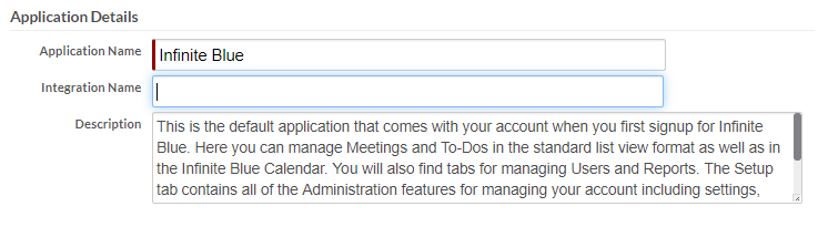
- Under Application
Details, you can update the following:
- Application Name
- Integration Name - The Integration Name should be unique across the tenant.
- Description
- An optional Custom Logo to appear in the upper-left corner of each page of the application. The maximum size is 256 KB. Additionally, you can choose to hide an application logo by selecting the Hide Logo check box.
- Properties in the New UI Specific
Settings area only apply when using the New UI:
- UI Blueprint — Controls how the application navigation and various menus inside the application are rendered. The page content does not change across blueprints. Two UI blueprints are available, Traditional and Modern - Vertical Menus. See UI Blueprints for more information.
- Application Theme — By default, the pages of your application use the Default theme to display their components. You can change the look and feel of you application by selecting a theme from the Application Theme list.
- Field Labels Render Mode — Specifies how labels are rendered with regard to field values. By default, labels are to the left of field values on desktops and above field values on mobile devices. You can change the default by selecting a different option:

- Use Horizontal Responsive Design — By default, Platform applications use vertical responsive design. Select this check box to use horizontal responsive design instead. See Vertical and horizontal responsive design for more information about responsive design.
- Use Native Calendar and Time Control on mobile devices — Select this check box to use native date and time controls on mobile devices.
- Right to Left Text Direction — Select this check box to use right to left text direction. This feature is to support languages, such as Arabic and Hebrew, that are written from right to left.
- Notifications Position — Specifies where to position notification messages based on the context of your application and set to display at the center, top corner or bottom corner. Select Centered to position a notification at the center. Select Top Corner to set the position to the upper right corner (default). Select Bottom Corner to set the position to the lower right corner.
- Enable
GridControl Selective Edit — Select a
required record count range to enable selective editing of
related records in a page.Note: When grid control component is rendered in selective edit mode, you can click edit icon against a grid row to enable editing. Additionally, double-clicking the grid row (for TabularGridControl forms) will also enable editing. Enabling grid control for selective editing will affect all grid components in an application.
- Bootstrap
Version — Select a bootstrap version to be
used during runtime of the application. Only users who have
an administrator role have the permission to make a
selection. By default, Bootstap version v4.x is selected.Note:
- This property is applicable only in the new UI.
- When you import an application by default, bootstrap version 4.x is applied.
- When you opt to use CDN, the bootstrap files are loaded from CDN based on the bootstrap version selected.
- Properties in the Corticon Decision Server
area let you configure up to three Corticon Server instances to
access from Automating business decisions with Corticon rules
triggers.

- Server to use — The selected radio button determines the server instance used by triggers in this application. Defaults to Development.
- Development or test server — The URL of the server instance to access in a development environment
- Staging server — The URL of the server instance to access in a staging environment
- Production server — The URL of the server instance to access in a production environment
- User Name / Password — The credentials used to access each server instance.
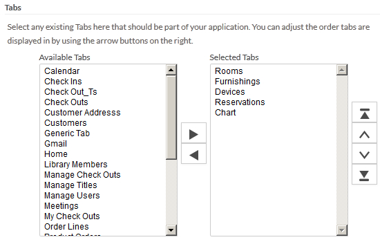
- Tabs - You
can add tabs from the Available
Tabs column, remove tabs from the Selected Tabs column, and reorder
the Selected Tabs column
using the arrow buttons:
- Core Objects, Dependent Objects, and User Roles that must be included in the application when it is published.
- Deployment
status specifies: