Creating and editing cards
The card editor allows you to create and edit cards for displaying in card containers on various devices.
The card editor includes the following features:
- You can resize coumns in the editor pane.
- You can drag and drop labels and values from sidebar/
The card editor toolbar includes the following:
- More text formatting tools
- Insert Horizontal Line
- Undo/Redo
- Select All
- Code View - Opens the card in an HTML editor view.
- Insert Link
- Insert Image
- Insert Video
- Upload File
- Insert Table
- RTL and LTE text direction - Allows you to change the card's text direction for an individual field. The card's text direction is determined by the user's language.
- Add Card Dimension, allows you to set the dimensions of a card to be displayed in a horizontal card container. This tool is not available when editing a card to be displayed in a vertical card container. You can set the card width for desktop and tablet devices, the card height, and CSS styles to apply to the card container.
- Add Text Limit, allows you to limit the amount of text displayed for text fields. You can limit the text by specifying a line count or by specifying a character limit
Creating a card
There are four ways to create a card:
- Start with an existing card design — Allows you to create a card quickly and easily by selecting fields to display in pre-designed components
- Start with an existing card layout — Allows you to choose a column layout for the card and select fields to display in each column
- Start with a blank screen — Allows you to design your own card layout and select fields to display.
- Start with any of the above options and edit the resulting HTML in any HTML editor.
To create a new card:
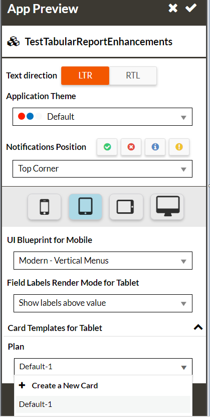
- Decide the object type for which you want to create a card and open a record list page for that object type.
- Open App Preview and select a device.
- Click + Create a New Card:
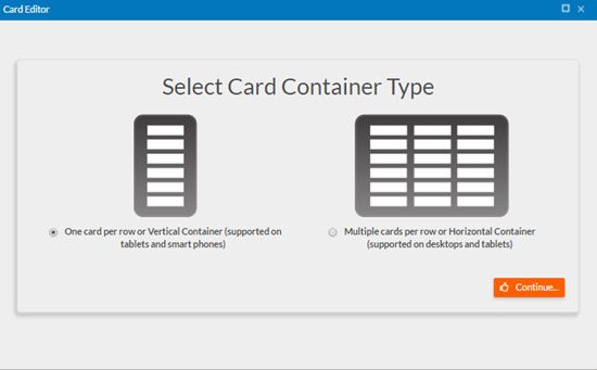
- Select a Card Container Type:
- Vertical container — Displays cards vertically; each card consumes the width of the screen. This option is supported on smart phones and tablets.
- Horizontal container — Displays cards in a grid; each card is has fixed dimensions; you can configure the dimensions in the card editor. This option is supported on tablets and desktops.
- Select a pattern for the card. You can select an existing design in the
Design tab or you can select an existing
layout or a blank card canvas from the Layout tab. The following screens show vertical card designs with
an example on a smart phone and horizontal card designs with an example on a tablet.
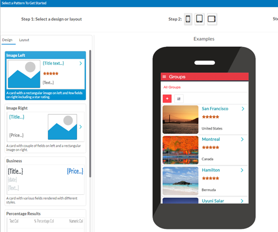
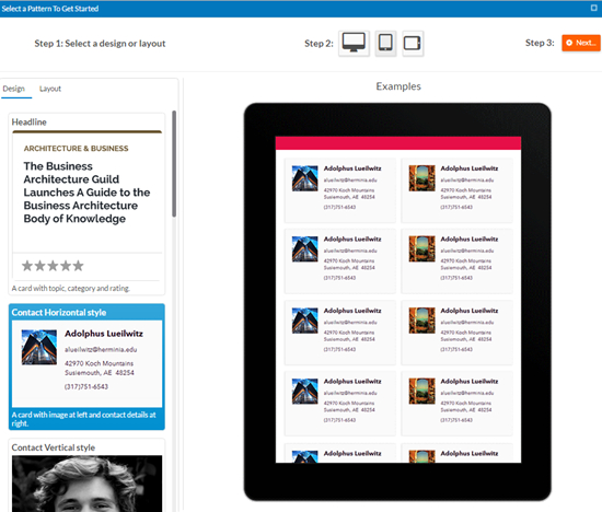
- Select the device(s) for which you want to create the card. Depending on the card container type, you can select smart phone, tablet in portrait mode, or tablet in landscape mode.
- If you selected a design, click Next and map components in the card to fields as described in Mapping components to fields. If you selected a layout, or after mapping components to fields, click + Create a New Card and edit the card in the card editor as described in Editing a card in the card editor
- Type a name for the card in the Card Name field and click Save to save the card.
Editing a card
To edit an existing card, click the edit icon next to the card:
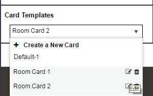
The card editor(add link) opens for the card.
Card options in the page editor
A view component (list view) now includes card-related properties you can set in the page editor:
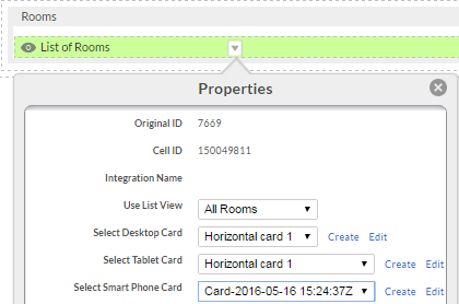
The properties Select Desktop Card, Select Tablet Card, and Select Smart Phone Card let you select the card to user for tablets and smart phones. Click Create to create a new card. Click Edit to edit the selected card.
See the following topics for details about mapping components to fields and using the card editor: