Editing a card in the card editor
When you start a card from a layout or from a blank screen, or after you have mapped the fields in the card, the card editor opens. The card editor is an HTML editor that includes Card Tools for adding components and other features to the card. In the card editor, you have the full power of HTML, CSS, and JavaScript hash templates at your disposal to create very good looking and very powerful cards.
The card editor toolbar contains buttons for formatting and aligning text, editing HTML, inserting images, videos, files, and tables, and for setting the text direction (LTR or RTL) for a field in the card (Text direction for the card is based on the user's language; you can override the direction for a field).
From the Values and Labels areas in the sidebar, you can drag values and fields onto the card.
The Use this card for buttons let you select the devices for which to use this card.
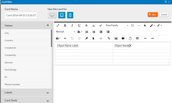
The screen below shows the card editor for a new card created from the 2 Column layout. When you create a card with this layout, the card is pre-populated with an Object Name Label, an Object Name value, and an object view link that drills down to the View page for a record. You keep, edit, or delete these as desired.
The card editor includes several card tools, available from the Card Tools area in the sidebar:

Card Tools include:
- Add Object View Link — Places an object view link on the card. An object view link drills down to the View page for a record.
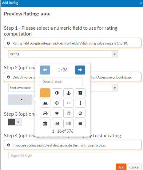
- Add Rating — Lets you add a star
rating component to the card. A star rating component can represent an Integer,
Decimal, Currency, or Percentage field with a range of values between 1 and 10, or a
Formula or Expression field that returns an Integer or Decimal value between 1 and
10. You can select an icon for the component (defaults to a star), an icon color,
and apply CSS styles to the star rating. Preview
Rating shows you what the resulting component will look like. If you
select the default icon or a Font Awesome star icon, Decimal values will render half
stars if the decimal part of the value is greater than or equal to 0.5.
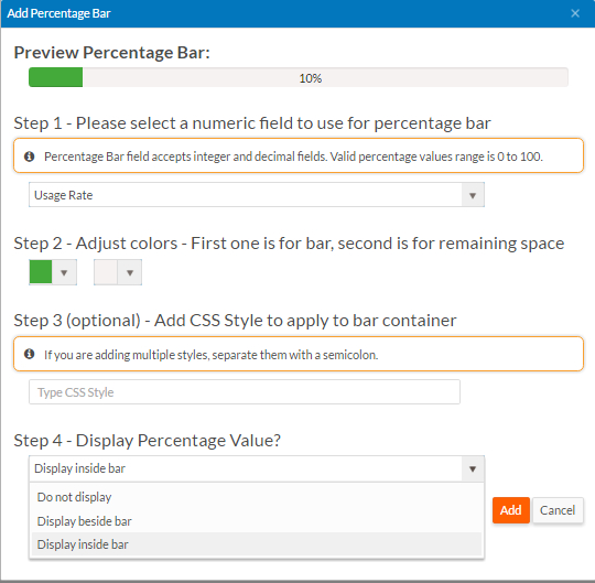
- Add Percentage Bar — Lets you
add a percentage bar to the card. A percentage bar can represent an Integer,
Decimal, Currency, or Percentage field with a range of values between 0 and 100, or
a Formula or Expression field that returns an Integer or Decimal value between 0 and
100. You can select colors for the bar, apply CSS styles to the bar container, and
specify whether to display the percentage value and where to display it. Preview Percentage Bar shows you what the resulting
component will look like.
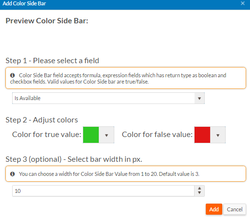
- Add Color Side Bar — Lets you
add a conditional color side bar to the card based on a Boolean value. A color side
bar can represent a Formula or Expression field with a Boolean return type or a
Checkbox field. You can choose the color for the bar when value is true or false and
you can choose the bar size. Preview Color Side Bar shows you what the resulting
component will look like.
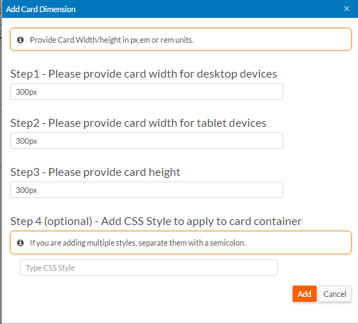
- Add Card Dimension — Lets you set the dimensions of a card to be
displayed in a horizontal card container. This tool is not available when editing a
card to be displayed in a vertical card container. You can set the card width for
desktop and tablet devices, the card height, and CSS styles to apply to the card
container. The screen below shows the Add Card
Dimension dialog:
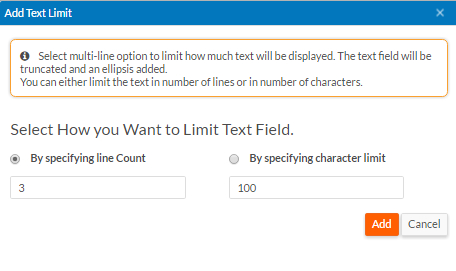
- Add Text Limit —Lets you limit the amount of text displayed for text
fields. You can limit the text by specifying a line count or by specifying a
character limit. The screen below shows the Add Text
Limit dialog:
At any time while editing a card, you can click the Code View button to view and edit the HTML source:
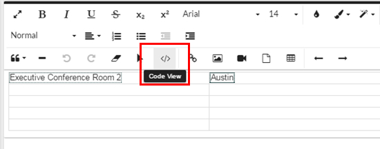
The HTML source opens:
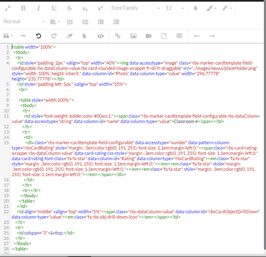
You can edit the HTML source in the card editor or you can copy the HTML source and edit it in a different HTML editor.
When you insert a field using the card editor, Platform generates the following HTML fragment (value or label):
<span data-column-id=”fieldId” data-column-type=”value”>
	<span data-column-id=”fieldId” data-column-type=”label”></span>
For example, the following HTML fragment was generated for a label
and value for a City field. Note that the data-column-id attribute uses the integration name of the City field,
which is city.
<span class="rbs-dataColumn-label" data-column-id="city"
	data-column-type="label" title="label - city">City</span>
<span class="rbs-dataColumn-value" data-column-id="city"
	data-column-type="value" title="value - city">Austin</span>
You can use the span element to
simulate what the card editor does, especially if you want to work in your own HTML
editor.
data-column-id attribute. Copy the source and paste it into your
HTML editor to keep the integration names available.The new card tools support the following:
- Add/Edit Card Script — Lets
you customize a card by executing scripts.
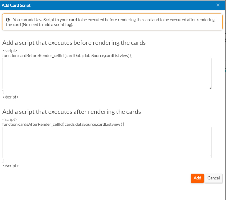
- Script that you add in the first box runs as soon as data
is fetched from the server and before rendering the cards. It takes three
arguments:
cardData— An array of the values used to render the carddataSource— The KendoDatasourceused by the cardcardListview— TheKendoListView(KendoMobileListViewfor mobile devices ) component that renders card items
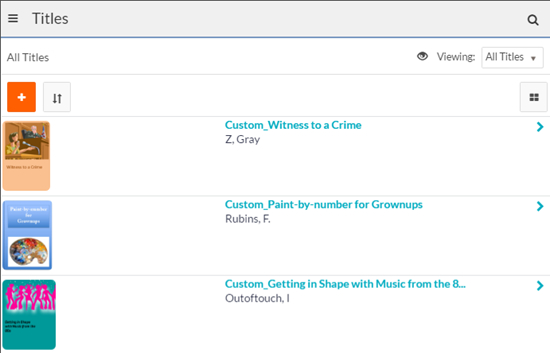
The following example prepends Custom_ to the name of each title record:
  var someData = "Custom_" + cardData["name"];
  cardData["name"] = someData;
The following screen shows the resulting cards on a tablet:
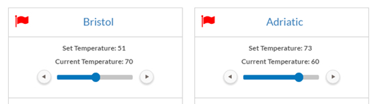
- Script that you enter in the second box runs once after
rendering all cards on the page. It takes three arguments:
cards— A list of all cards on the pagedataSource— The KendoDatasourceused by the cardcardListview— TheKendoListView(KendoMobileListViewfor mobile devices ) component that renders card items
The following example adds a
kendoSlidercomponent to each card on the page:if(cards){ //Iterate through all card list item for(var i=0;i<cards.length;i++){ var card = $(cards[i]); //Find an element where we want to render kendo slider var tempSliderEle = card.find('.temperature'); tempSliderEle.show(); var tempSlider = tempSliderEle.data('kendoSlider'); var recUid = card.attr('data-uid'); if(recUid){ var rec = dataSource.getByUid(recUid); var recId = rec["recordId"]; var currTempVal = rec["Set_Temperature"]; var confirmMsgEle = card.find('.confirmTempChange'); if(!tempSlider){ tempSliderEle.kendoSlider({ max:100, min:0, value:currTempVal, dragHandleTitle:'Drag to change temparature', tickPlacement:'bottomRight', recId:recId, currTempVal:currTempVal, }); } } } }The following screen shows the resulting cards on the page:
- Script that you add in the first box runs as soon as data
is fetched from the server and before rendering the cards. It takes three
arguments:
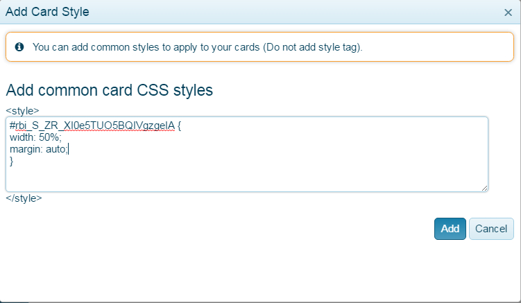
- Add/Edit Card Style — Lets
you add custom CSS styles. By default, the styles apply to all sections on a page.
This typically works just fine. But if a page contains multiple list views, and you
want different styles for each, you can make the style specific to the page section
that contains the list. To apply a style to a specific section, use the section
original ID prefixed by . You can find the section ID by opening
the page in the page designer and selecting the section. For example, to identify a
section with the original ID of
ZR_XI0e5TUO5BQIVgzgeIA, use: