Cards and card containers
Platform uses cards and card containers to render record list views on mobile devices. A card is analogous to a row in a record list view. A card container is analogous to the grid that holds the row. There are two types of card containers:
- Vertical — A vertical, scrollable list of cards. Each card consumes the width of the screen. You can use vertical card containers on smart phones and tablets.
- Horizontal — A scrollable grid of cards. Each card is has fixed dimensions; you can configure the dimensions in the card editor. You can use horizontal card containers on tablets and desktops.
The card editor and wizard now allows you to design vertical and horizontal card containers. You can select which container Platform will apply depending on whether the user is accessing the application with a mobile phone, a tablet (in horizontal or vertical orientation), or a desktop.
The differences between horizontal and vertical card containers include:
- You can only use horizontal card containers for desktop and tablet devices.
- Horizontal cards have a fixed width (cards for vertical container use the whole width of the device).
- A horizontal container can render multiple cards on the same line.
- A horizontal card container supports paging, but not infinite scrolling.
- To perform actions in the group actions menu, you can select a card by clicking it and you can select multiple cards using the control key.
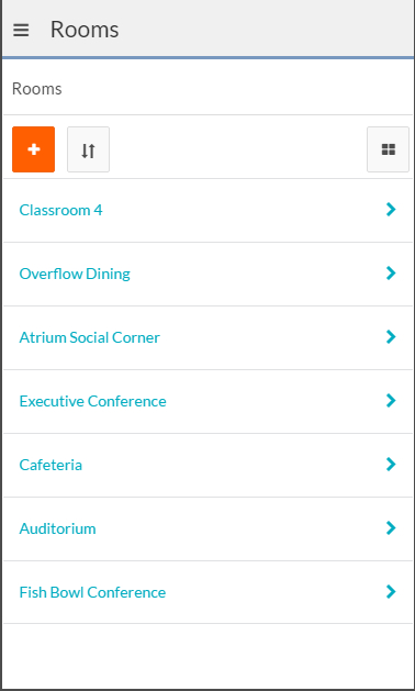
By default, a vertical card container will render with the default card. It displays the record name and a way to drill down to individual records:
There is no default horizontal card.
You can change the view to the regular record list view (grid) by clicking the icon at the top right, and you can toggle the view back to the card container view. You can create your own cards from a selection of existing designs and layouts or from scratch. See Creating and editing cards for details.