Record List Options, Mobile and Tablet Support
Improved support for mobile devices
Platform offers improved support for the responsive user interface on mobile devices, with a focus on tablets. Only deployed applications are available on mobile devices; setup pages are not included. Automatic modifications to the user interface on tablets and smartphones, detailed below, are designed to provide a better user experience on each type of device.
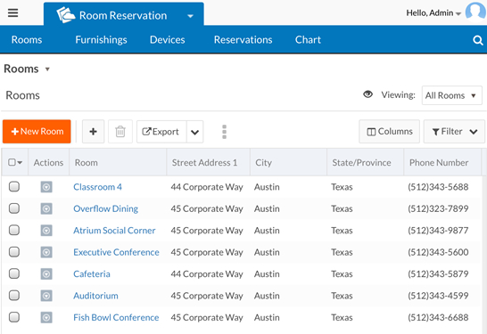
The following screen shows an application page on a tablet:
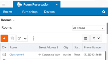
The following screen shows the same application page on a smartphone:
Mobile support for both tablets and smartphones
Support on both tablets and smartphones include the following:
- The default font size on a mobile device is the desktop font size plus 2 (14pt by default).
- The Platform menu:
- Is rendered in non-administrative mode.
- Includes a Log Out menu item.
- Does not include the Subscription Details menu item.
- The application switcher is rendered in non-administrative mode.
- On record list pages:
- Global search is rendered in non-administrative mode.
- The page menu only contains the new record menu item.
- The page options menu is not displayed.
- The view selector is not displayed if there is only one view available.
- Inline editing is disabled.
- Only the refresh action is available for charts and gauges.
- You can sort columns (short press on column header) and change column order by pressing longer and dragging a column to the desired location.
- The branding header and footer are not displayed.
- On record view pages, the only action in the more actions menu is Delete.
Tablet support
This release focuses on improving the user experience on tablets with the responsive user interface.
The tablet-specific user interface includes the following:
- The user profile menu does not include the Log Out menu item. Instead, Log Out is in the Platform menu.
- The view selector does not contain any administrative actions (cannot edit, color code, or clone a view).
- Report links only contain Email this Report.
Smartphone support
The smartphone-specific user interface includes the following:
- Buttons on the page toolbar have no text:
- On record list pages, the list component has no Actions column.
- On record view pages that contain a grid component with
related records, there is no Attach
button (on desktops and tablets, an Attach button is in the grid toolbar):
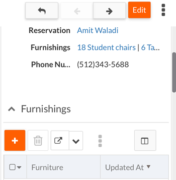
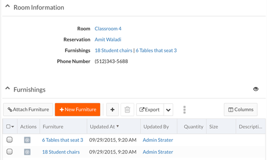
The screen below shows the Attach Furniture button on a tablet:
- Report links do not have any actions.
- There is no Actions column in record lists.
- There is no user profile menu.
- The filter button is on the record list header.
- The Columns button is on the record list header.
- There is no quick create button on record list pages. You can still create records using the new record page.
- On the record list page toolbar, Export is not displayed unless the property
rb.ui.options.showGridExportFunctionOnSmartPhoneis set totrue. - On the record list page toolbar, the actions menu is not
displayed unless the property
rb.ui.options.showGridMoreActionOnSmartPhoneis set totrue. - The view selector has no label.
- The Platform menu does not have the Recycle Bin or Recent Items menu items.
New record list page options
Record list pages now include the following options:
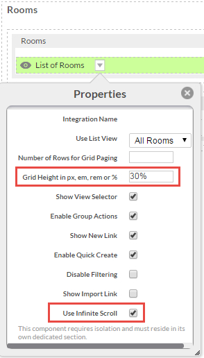
- Support for Infinite Scrolling: You can specify infinite scrolling for the record list instead of paging through records. This is particularly useful on mobile devices, where users expect infinite scrolling in their apps.
- Support for specifying list view grid height: You can specify the height of the record
list in the page editor. This is useful for:
- Supporting multiple device sizes with a single policy
- Pages where the record list is the only element on the page and you want it to take up all of the available height of the browser window — when combined with infinite scrolling, this provides a very natural experience on mobile devices.
- Pages that contain other elements, such as charts, reports, or gauges — rendering a smaller list height allows room to display other page elements.
- px — The height of the list in pixels
- em — The height of the list, where the unit is the font size of the container (which is the parent element)
- rem — The height of the list, where the unit is the font size of the root element (which is the html element; see Custom CSS for examples of rules that use the html element.)
- % — The height of the list in relation to the available space on the page without having to scroll (the view port)
- empty or -1 —
You enable/disable infinite scrolling and set the list view grid height in the Properties drop-down menu for a view component in the page editor as shown below:
User interface changes on record list page
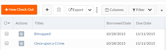
On record list pages, the column selector has been replaced with a Columns button next to the Filter drop-down menu. The functionality stays the same; the Columns button allows a user to select which columns to display in the record list.
Old column selector:
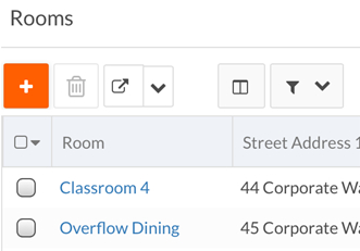
New Columns button:
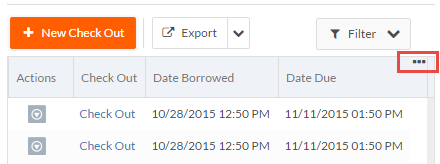
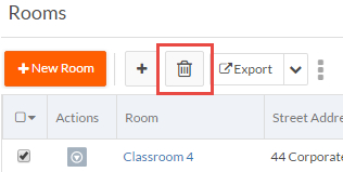
On record list pages, the Delete button no longer contains text:
Customizing menus
You can customize how the menus in the application header are rendered. The following options are available in the javascript object:
rb.newui.options.customizeMenuDisplay:rb.newui.options.customizeMenuDisplay.customOverflowForMenus.overflowMenusPerColumn— Sets the number of menu items per column in the overflow menu. Defaults to 10.rb.newui.options.customizeMenuDisplay.customContainerForChildMenus.enableIfChildMenusGreaterThan— When a tab has many child menus, you can specify at what point (in terms of the number of child menus) the child menus should be split into multiple columns instead of in a single column. Defaults to 10.rb.newui.options.customizeMenuDisplay.customContainerForChildMenus.childMenusPerColumn— Sets how many child menu items are displayed under each column. Defaults to 10.
You can also customize the page menu to set the number of menu actions to be
displayed in each column using
rb.newui.options.customizeMenuDisplay.pageTitleMenus.childMenusPerColumn.
Defaults to 10.
User changes to record list page are saved on a per view/per device basis
When a user makes changes to the record list on a page, such as swapping columns, hiding columns, or resizing columns, those changes are now saved per view and per device. For example, if a user makes these changes on their smartphone, the changes will not appear on their desktop.
Enhanced page construction log
With the New UI, the entire page renders on the client side using json data returned from Platform. page Construction logging has been enhanced on client side for New UI pages. This will assist in quickly debugging and troubleshooting any possible issues.
The page construction log includes:
- The page components rendered (sections, page cells, etc.)
- The order in which the components were rendered
- The time required to render each
To generate the page construction log, execute the following JavaScript statement on the
browser console:
rb.newui.page.PageContext.printPageConstructionLog()
Sample Log:
PageContext [ Time: 27 ms ]
CustomSideBar [ Time: 2 ms ]
HeaderFooter [ Time: 183 ms ]
Page - 90106 [ Time: 169 ms ]
	Section - 221353 - All Object1s [ Time: 136 ms ]
	   Cell - 221354 [ Time: 109 ms ]
	Section - 227222 - HTML Section [ Time: 6 ms ]
        Cell - 227223 [ Time: 1 ms ]
	Section - 234194 - Section non-mobile [ Time: 5 ms ]
        Cell - 234195 [ Time: 1 ms ]
In addition, you can enable more verbose logging at the time of page creation in browser client. To enable, add following script component to an application's custom sidebar or header:
<script id="executeBeforeUIStarts">
 (function () {
  try {
    //execute only for new ui...
    if (!rbf_isNewUI()) {
      throw 'This Script is written specific to New UI Context';
    }
    rb.newui.page.PageContext.showPageConstructionLog(true);
  }
  catch (err) {
    if (console) {
      console.log(err);
    }
  }
}) ();
</script>
Sample log printed on browser console:
Creating - HeaderFooter
Completed - HeaderFooter [ Time: 139 ms ]
Creating - Page - 733968
Creating - Section - 734015 - All Message2s
Creating - Cell - 734016
Completed - Cell - 734016 [ Time: 300 ms ]
Completed - Section - 734015 - All Message2s [ Time: 122 ms ]
Creating - Section - 759955 - New Section
Creating - Cell - 759956
Error appending inline script: TypeError: Cannot read property 'util' of undefined
Completed - Cell - 759956 [ Time: 1 ms ]
Completed - Section - 759955 - New Section [ Time: 2 ms ]
Completed - Page - 733968 [ Time: 145 ms ]
Automatic addition of RTL (right to left) library
The RTL version of the Bootstrap library version 3.3.4 is now automatically included for the application when you switch to RTL mode by adding &rtl=true. Prior to this release, an administrator needed to include this library in a custom header to support RTL mode.
Performance improvements
Depending on the page type and its content, overall rendering performance of pages has been improved by 10% to 20%.
New client-side JavaScript functions to detect mobile devices
The following JavaScript functions are now available for script customization (can be used in custom sidebar or custom header):
- rb.newui.util.isMobile() — Returns
trueif Platform is running on a mobile device (tablet or smart phone) - rb.newui.util.isTablet() — Returns
trueif Platform is running on a tablet - rb.newui.util.isSmartPhone() — Returns
trueif Platform is running on a smartphone
See Client-side JavaScript for more information.
Updated CSS rule for Microsoft Edge browser
In the previous release, an html element could contain the x-k-edge
CSS rule. In this release, the CSS rule k-edge is also supported.
Support for the rule x-k-edge is maintained in this release but
will be removed in the next release.