Custom CSS
You can use custom CSS to modify certain aspects of the user interface for a particular application. Add the custom CSS to either the application's custom header or to the application's custom sidebar. You can also use custom CSS to modify the user interface for all applications in a tenant. This requires you to upload a CSS file as a hosted file and specify the hosted file as the CSS Stylesheet on the Account settings page.
When you add custom CSS to an application or to a tenant, you are overriding the defaults in the default Platform CSS files. You can view the contents of these files to gain insight into customizations you want to make.
The main CSS file for the New UI is newui.css. There is also a CSS file for each built-in theme. The files are in the following locations:
- Platform Private Cloud: http://localhost:8830/prod1/css/newui/ — For example, to view newui.css when using a tenant running the PAS server, you would use the URL http://localhost:8830/prod1/css/newui/newui.css.
- Hosted Platform: https://app.infiniteblue.com/prod1/css/newui/ — For example, to view newui.css, you would use the URL https://app.infiniteblue.com/prod1/css/newui/newui.css.
You can also see the CSS files used on a particular page by viewing the page source in your browser.
The following are a few of the ways in which you can customize the user interface, with links to examples of each.
Detecting mobile devices
You can trigger CSS rules based on the device by leveraging the following classes added to the html element:
- rbs-device-mobile {} — Will be present when the device is either a smartphone or a tablet
- rbs-device-smartPhone {} — Will be present when the device is a smartphone
- rbs-device-tablet {} — Will be present when the device is a tablet
See an example that uses these classes.
Detecting UI Blueprint
To customize the UI based on the application blueprint, you can apply different CSS rules by leveraging the following existing classes present on the body element.
- rbs-ui-template-type-default (Traditional)
- rbs-ui-template-type-2 (Modern Vertical BP)
- rbs-ui-template-type-custom
See an example that uses these classes.
Changing the page title width
On view and edit pages, the page title area has two parts:
- The page title
- The page toolbar.
- On medium and large devices (width is 769px or greater), the width is shared equally by both parts.
- On small devices (width is 768px or less), the page title consumes 30% of the width and the page toolbar consumes 70% of the width.
Administrators can override these proportions at the application level to change the percentage of space occupied by the page title to give the page toolbar more space to display actions in the toolbar rather that in its overflow using the following CSS classes:
.rbs-objectViewTitle— CSS class to customize the width of the page title in a record view page.rbs-objectEditTitle— CSS class to customize the width of the page title in a record edit page
See an example that uses these classes.
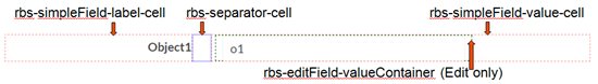
Controlling how space is consumed in columns
View and edit pages can contain up to four columns. You can control the space consumed within a column by the field label, the field value, the separator between them, and, for edit pages, the editable field value. Use the following CSS classes to control the space:
- rbs-simpleField-label-cell — Controls the space consumed by the field label
- rbs-simpleField-value-cell — Controls the space consumed by the field value
- rbs-separator-cell — Controls the space consumed by the separator between the label and the value
- rbs-editField-valueContainer — Controls the space consumed by the editable field value (edit pages only). This is specified as a percentage of the width consumed by the field value (rbs-simpleField-value-cell).
The graphic below illustrates what each of these CSS classes control:
You specify the space consumed as a percentage of its container, except for rbs-editField-valueContainer, which is specified as a percentage of the width consumed by the field value.
Default values for the field label, the field value, and the editable field value depend on the screen width.
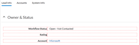
You can see the column layouts by adding &demoFieldsLayout=true to the end of the URL for the page. The screen below shows the space consumed by field labels and values on a view page:
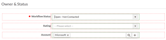
The screen below shows the space consumed by field labels, values, and editable values on an edit page:
See an example that uses these classes.