Configuring a grid control
Follow these steps to configure a grid control:
- Open the Configure Grid Control page in one of the
following ways:
Navigate to the page containing the grid and click Configure Grid:
 Navigate to the Pages table in the object view page and select Config next to the page containing the grid control:
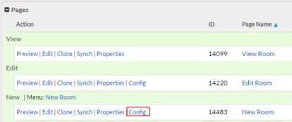 The Configure Grid Control page opens.
 - From the Relationship drop-down, select the relationship for the records you want the grid to display.
- Click Next. The Select Fields for Columns of Grid page appears.
- From the Available Columns, select the
fields you want to appear as grid columns and use the arrows to move them to the
Selected Columns list. Optionally,
reorder the columns using the up and down arrows.
Although, you can use most field types in a grid component, there are some limitations. For example, you cannot use filtered lookup fields.
- Click Next.
The grid control configuration page appears:
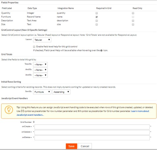
- Select the following settings as needed:
Select the Required in Grid checkbox for fields to make them mandatory.Select Read Only for fields to ensure that these fields provide no write permissions to the users. This operation will have no effect for the fields selected as Required in Grid.From the Layout dropdown, select the required grid control layout — Tabular or Responsive. This option is applicable only for the New UI. The Tabular layout is selected by default which enables users to edit related objects like in a spreadsheet.Check the Enable field-level help for this grid control to enable field-level help.Note:
- Enable field-level help for this grid control is reflected in the grid only when the Enable field-level help for this application checkbox is selected at the application level.
- The field-level help icon appears next to a field column header in a tabular layout and next to a field in a responsive layout.
Optionally, specify sorting for columns.Configure Lookup fields for related records:- Choose Selector or Picklist style from the Applications drop-down menu.
- Select Enable Quick Create to create a related record using Quick Create pop-up.
- From the Use List View drop down, select the view to display the related records.
Optionally, specify custom JavaScript code to be executed when a grid row is added, updated, or deleted. For more information, see Grid Control Examples and API. - Click Save.
Responsive Layout
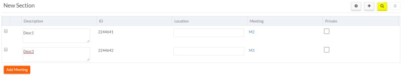
The Responsive layout option enables users to edit the related objects as inline forms. Each grid row is housed in its own panel with a responsive layout as depicted below. This feature offers better support for mobile devices and tablets.
Each grid row can be collapsed or expanded individually. In addition, to expand/collapse all rows in one command, use the widget at the top right of the grid section.