Workflow Designer Interface
This topic describes the various components, fields and actions activities that comprise the Workflow Designer interface.
Workflow Canvas
The Workflow Designer’s canvas is the place where you will perform the following activities to create your workflow process.
- Design and rename a workflow process
- Add new or use existing statuses
- Connect statuses
- Add new or associate existing actions to the workflow process
- Show or hide the actions label
- Move, resize and delete statuses and actions
- Perform actions using the Canvas Toolbar options
- Zoom and pan a workflow process
- Close the workflow designer
Statuses panel
The Statuses panel contents are hidden from the view by default, to provide more space for the canvas. The panel allows you to drag statuses and use those in a workflow process.
Here’s a sample view of how a status appears on the canvas in different states.
| State | Visual Status |
|---|---|
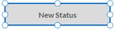
| Unsaved Status - Default |

|
| Unsaved/Saved - Unconnected Status -Hover |
|
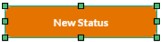
| Unsaved/Saved - Unconnected Status - Selection |
|
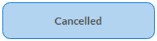
| Saved Unconnected Status - Default |
|
| Saved Connected Status |

|
| Saved Default - Connected Status |
|
Action Label – Show/Hide
As the name indicates, Action Label - Show/Hide allows you to show/hide the actions label from the workflow process diagram. This helps to save space and visualize your statuses better. By default, the Action Label will be shown. An action connector line is automatically created when you connect two saved statuses. An Action pop up appears displaying the list of all existing actions if available for the target status, when two statuses are connected. This helps you to change the status to the target status. When there are no existing actions, the Actions pop up will be populated only with an Add New Action icon.
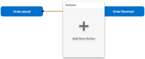
Here’s a sample view of the Action Labelthat shows existing actions for
the target status.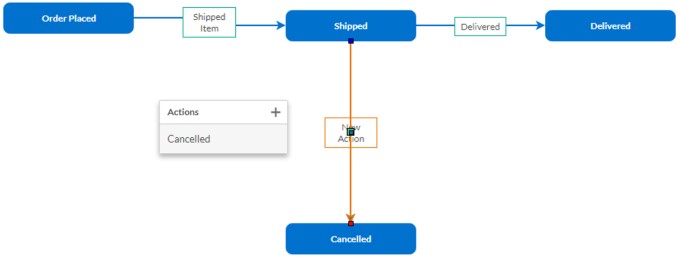
Here’s a sample view of how an action appears on the canvas in different states.
| State | Action |
|---|---|
| Unsaved Action - Default |  |
| Unsaved Action - Selection | 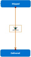 |
| Saved Action - Default | 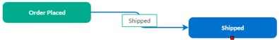 |
| Saved Action - Selection | 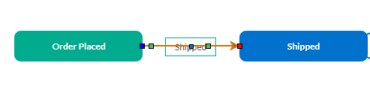 |
Canvas Toolbar options
Use the icons in the Canvas Toolbar to perform the following activities to design a workflow process:
| Icon | Icon Name | Description/Result |
|---|---|---|
 | Add New Status | You can drag a status anywhere on the canvas and rename it. To remove a status from the canvas, click Add New Status again or select the status and press the DELETE key. |
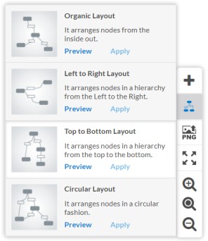
 | Layouts | You can choose to preview a preferred layout and apply it for the workflow process to
retain the position of the statuses. Note:
|
 | Save as PNG | Downloads the workflow process diagram to your system and saves it as a .PNG file. |
 | Fit diagram to available space | Fits the workflow process size to the canvas. If the workflow process size is large, this will shrink and fit it to the canvas. |
 | Zoom In | Magnifies the workflow process to make it appear much larger and clearer. Note: Click
in the white space on the canvas and drag the mouse to pan and view
the entire diagram when a workflow process image is
magnified. |
 | Restore zoom level to default | Restores the original size of the workflow process. |
 | Zoom Out | Reduces or alters the size of the workflow process. |
Here’s a sample view of the Layouts: