Using buttons on pages
You can add buttons to view, new record, edit, or status change pages. These buttons will appear in the page toolbar, at the top right of the application page. When a user clicks a button, the button can perform one of the following actions:
- Run JavaScript.
- Open a URL in a new browser window.
To manage buttons, click Buttons in the ribbon on an object definition screen to navigate to the Buttons table and select one of the following:
- Edit — Edit the button.
- Clone — Create a new button that is a clone of this button.
- Del — Delete the button.
- Button name — View button properties.
To create a new button:
- Click New Button. The New Button page opens.
- Specify the following:
- Display Label — Enter the text that will display on the button.
- Button Name — Optionally enter the button's name (used as HTML tag "name"). Defaults to Display Label with an underscore for each space..
- Behavior — The action to perform. Select one of:
- Run client-side JavaScript
- Open URL in new window
- Show In — Specifies whether this button is displayed on desktops, tablets, and/or smart phones. Displays on all devices by default. Deselect a device type if you do not want the button displayed on it. Devices are represented by icons in the following order: desktop, tablet, smart phone. The Buttons section of a Setup Application page contains a Show In column that displays your choices.
- Toolbar Responsive Overflow Rule — Enables you to control
how the buttons (custom buttons and workflow action buttons) are positioned in
relation to the overflow menu. Depending on your requirement, you can choose one of
the options from the drop-down list.
- Always show in overflow menu — Forces the button in the overflow menu irrespective of available space.
- Never show in overflow menu — Forces the button in the toolbar irrespective of available space.
- Show in toolbar when there is space — Places the button in the toolbar if there is space.If not, the button is placed in the overflow menu. This option is selected by default.
Note: You must ensure that there is enough space on your page when you choose the Never show in overflow menu option. - Button Script or URL — The JavaScript template or the URL template. Both templates may include record's tokens to be replaced with actual values at runtime. See Working with templates for information about templates.
- Show button – Condition formula —
Add a conditional formula. This conditional formula is evaluated before adding a
button to the page. The button will be added only if the evaluation results in Boolean
value TRUE.
With the condition formula feature, you can dynamically decide whether to add a button depending on a record's workflow status field, user's role, and so on.
- Add to Pages — Select the pages to which you want to add the new button.
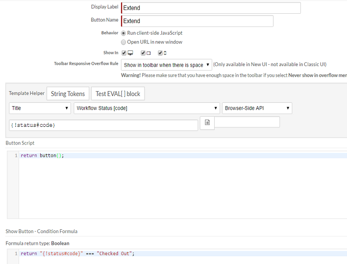
The following screen shows the properties of a Extend button that appears for a title with status as Checked Out.
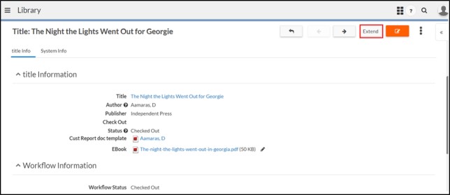
The following screen shows the button on an application page:
You can add or remove buttons from a page by clicking the Properties link for the page in the page table on an object view page.