Improved Editing Capabilities
New features in this release that improve and extend editing capabilities include:
- Card Editor tools for adding custom scripts and CSS styles
- Improved table tools in rich text editor for Text Area
- Ability to select devices on which to display page tabs
- Ability to hide or show Export button on record List
- Ability to hide or show empty fields on View pages
- Ability to remove or show field labels on Edit pages
- New CSS class to size text areas
Card Editor tools for adding custom scripts and CSS styles
After you create a new card template, you can edit it. In this release, the Card Tools menu of the Card Editor allows you to add:
- Custom scripts that Platform executes before and/or after a card renders to customize its contents. For example, you can insert text or add widgets, such as Kendo UI controls
- Custom CSS styles

The new card tools support the following:
- Add/Edit Card Script —
Lets you customize a card by executing scripts.
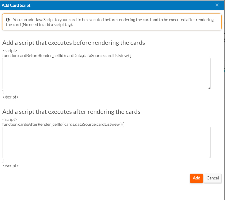
- Script that you add in the first box runs as soon as
data is fetched from the server and before rendering the cards. It takes
three arguments:
cardData— An array of the values used to render the carddataSource— The KendoDatasourceused by the cardcardListview— TheKendoListView(KendoMobileListViewfor mobile devices ) component that renders card items
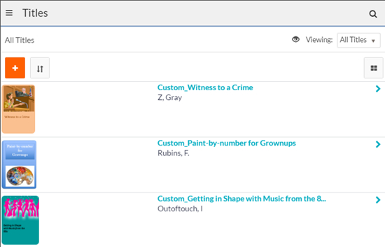
The following example prepends Custom_ to the name of each title record:
  var someData = "Custom_" + cardData["name"];
  cardData["name"] = someData;
The following screen shows the resulting cards on a tablet:
- Script that you enter in the second box runs once after
rendering all cards on the page. It takes three arguments:
cards— A list of all cards on the pagedataSource— The KendoDatasourceused by the cardcardListview— TheKendoListView(KendoMobileListViewfor mobile devices ) component that renders card items
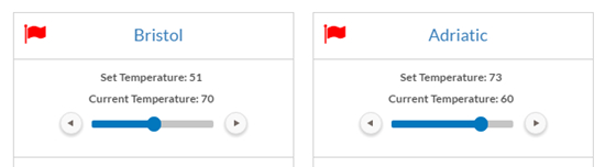
The following example adds a
kendoSlidercomponent to each card on the page:if(cards){ //Iterate through all card list item for(var i=0;i<cards.length;i++){ var card = $(cards[i]); //Find an element where we want to render kendo slider var tempSliderEle = card.find('.temperature'); tempSliderEle.show(); var tempSlider = tempSliderEle.data('kendoSlider'); var recUid = card.attr('data-uid'); if(recUid){ var rec = dataSource.getByUid(recUid); var recId = rec["recordId"]; var currTempVal = rec["Set_Temperature"]; var confirmMsgEle = card.find('.confirmTempChange'); if(!tempSlider){ tempSliderEle.kendoSlider({ max:100, min:0, value:currTempVal, dragHandleTitle:'Drag to change temparature', tickPlacement:'bottomRight', recId:recId, currTempVal:currTempVal, }); } } } }The following screen shows the resulting cards on the page:
- Script that you add in the first box runs as soon as
data is fetched from the server and before rendering the cards. It takes
three arguments:
- Add/Edit Card Style — Lets you add
custom CSS styles. By default, the styles apply to all sections on a page. This
typically works just fine. But if a page contains multiple list views, and you
want different styles for each, you can make the style specific to the page
section that contains the list. To apply a style to a specific section, use the
section original ID prefixed by . You can find the section
ID by opening the page in the page designer and selecting the section. For
example, to identify a section with the original ID of
ZR_XI0e5TUO5BQIVgzgeIA, use: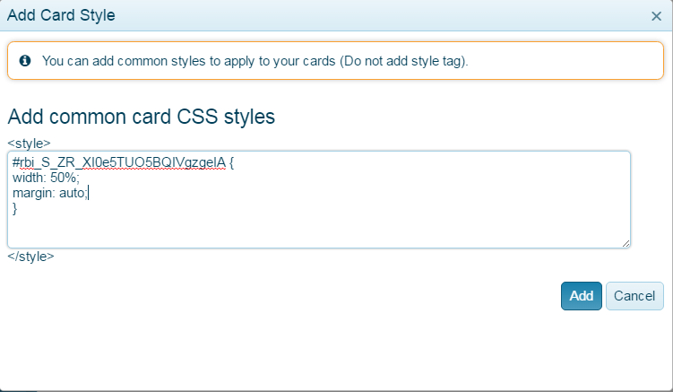
Improved table tools in rich text editor for Text Area fields
When you create or edit a Text Area field, you can select the Use Rich Text (HTML) Editor check box to enable the rich text editor for end users. In this release, the rich text editor has been enhanced in the following ways:
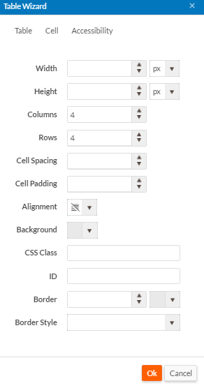
- You can now drag the table outline to resize columns or rows.
- A new Table Wizard
allows you to create table attributes while creating a new table or editing
an existing table.
Ability to select devices on which to display page tabs
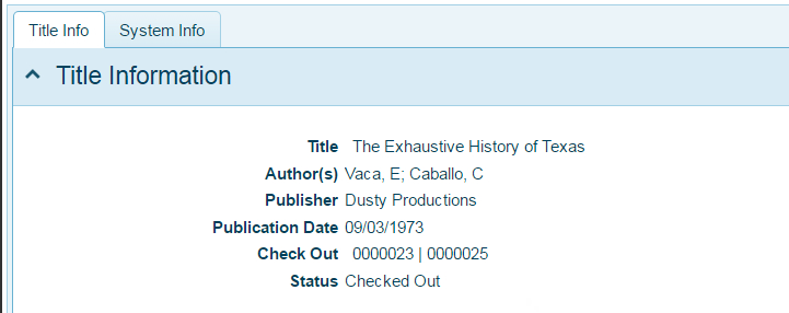
The page Platform creates for viewing record details contains two tabs by default as shown in the screen below.
To select which devices you want a tab to show on, follow these steps:
- Navigate to the page that contains the tab.
- Open the Properties
menu for the tab as shown below:
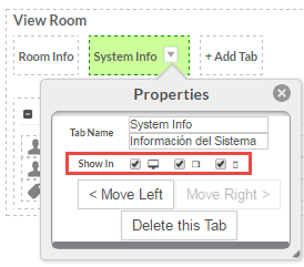
- Select the appropriate device(s).
See Page tabs for more information about page tabs.
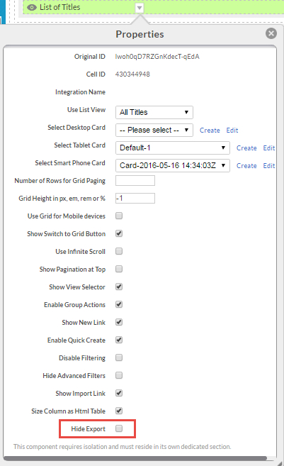
Ability to hide or show Export button on record List pages
Administrators can now hide or show the Export button on record List pages from the page editor by selecting or deselecting Hide Export in the Properties menu for the view component:
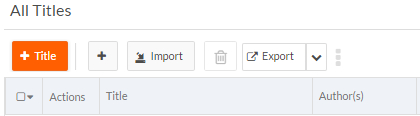
The following graphic shows the page with the Export button:
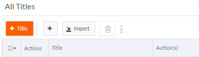
The following graphic shows the page without the Export button:
Ability to hide or show empty fields on View pages
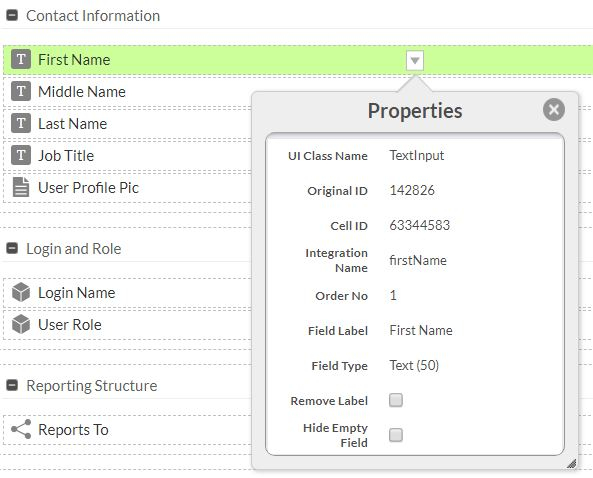
Administrators can now hide or show specific empty fields on View pages from the page editor by selecting or deselecting Hide Empty Field in the field's Properties menu.
Ability to remove or show field labels on Edit pages
Administrators can now remove or show specific field labels on Edit pages from the page editor by selecting or deselecting Remove Label in the field's Properties menu. If a field with some value is selected for removal, the field will not be visible in the UI but, it's value will remain visible. Previously, hiding field labels on Edit pages required writing code. See removeFieldLabel() for information about hiding field labels programatically.
New CSS class to size text areas
A new CSS class, rbs-editField-valueContainer-textArea, provides the same functionality
for text areas that the rbs-editField-valueContainer-richTextEditor class does for the rich
HTML editor. The new class defines the space consumed by a Text Area field inside of its container, with a
default value of 95%. You can use any valid CSS
attributes.
The following example sets the space consumed by text areas to 50%. In this example, it is set in a custom sidebar script:
<style>
.rbs-editField-valueContainer-textArea {
width: 50%;
}
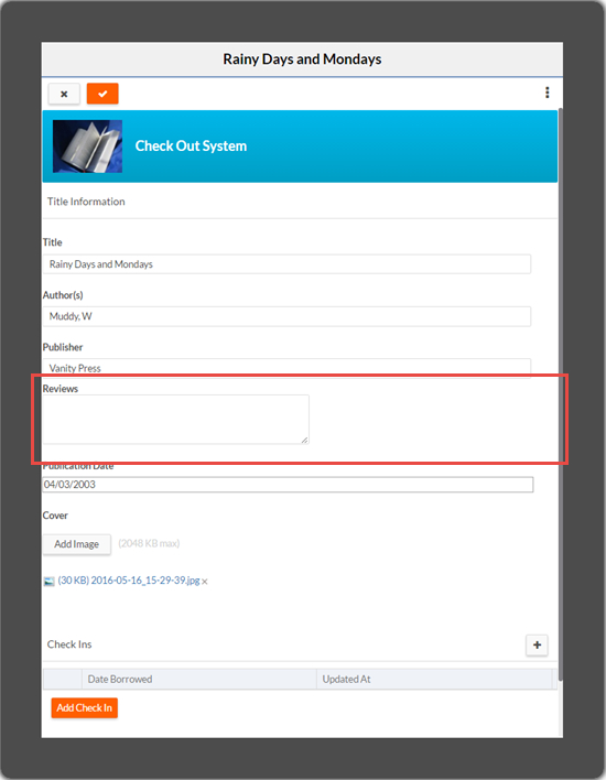
</style>
The resulting Edit page shows the Reviews text area on a tablet: