App Preview and App Settings - Sapphire UI
App Preview
Sapphire UI enables a user to preview and change properties such as Page Style, Navigation Mode, Text Direction, Application Theme, etc. at the application level, by following the steps below:
-
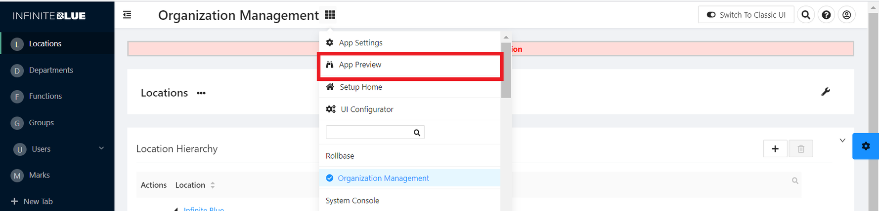
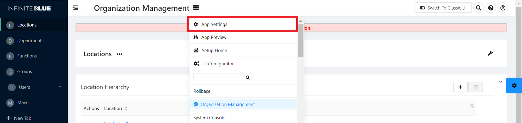
On the application page, expand the Application Switcher Menu and click App Preview.
-
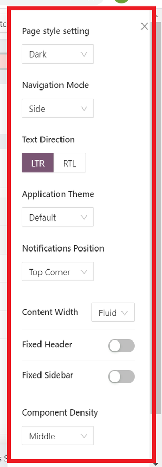
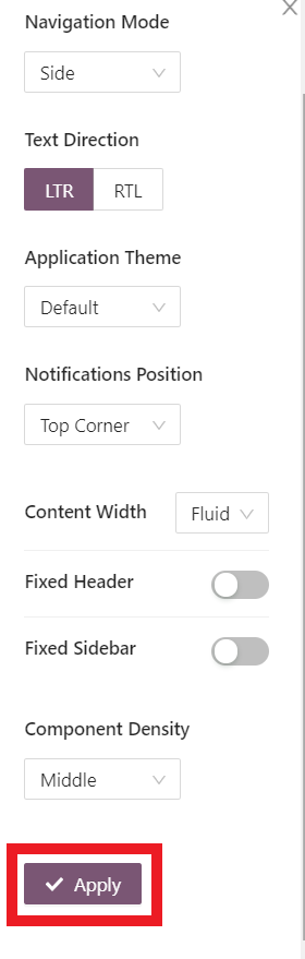
Explore the App Preview Menu that appears on the right side, with options to change the Page Style, Navigation Mode, Text Direction, Application Theme, etc.
-
Page Style Setting – Choose the overall page display style - Dark or Light.
-
Navigation Mode – Choose the navigation mode - Side, Top or Mix.
-
Text Direction - LTR or RTL
-
Application Theme - Default and custom themes.
-
Notifications Position - Top Cornered, Bottom Cornered, or Centered.
-
Content Width – Choose the width of the displayed content - Fluid or Fixed.
-
Fixed Header – Toggle to enable/disable a fixed header on the application page.
-
Fixed Sidebar – Toggle to enable/disable a fixed sidebar on the application page.
-
Component Density – Choose the density of the components displayed on the application page - Small, Middle & Large.
 Note: If a user has created custom themes, then these themes also appear in the Application Theme drop-down list.
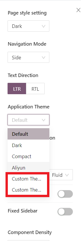
-
-
Preview and apply the settings by clicking Apply.
App Settings
The Theme can also be changed by navigating to App Settings, and following the steps below:
-
On the application page, expand the Application Switcher Menu and click App Settings.
-
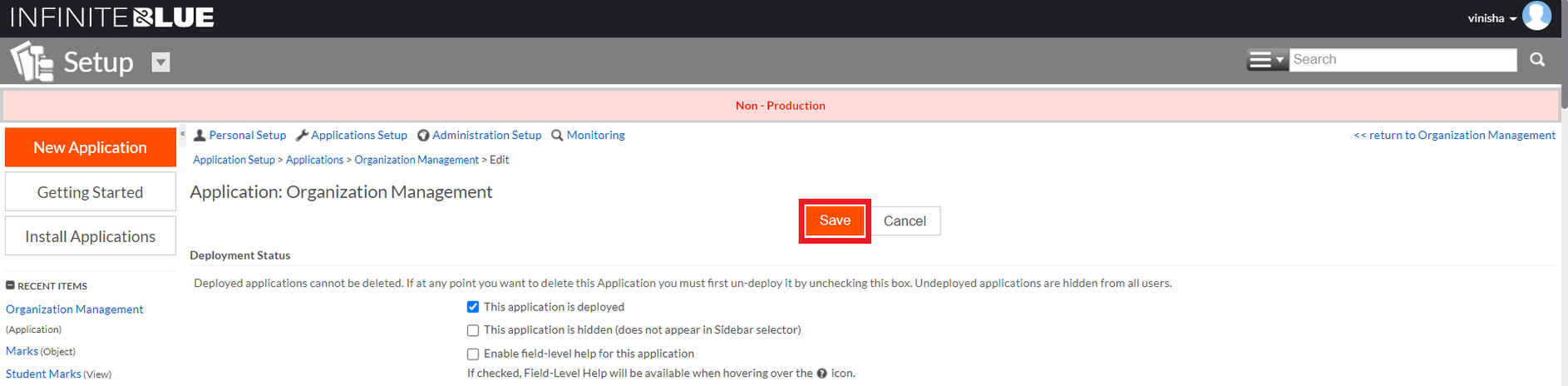
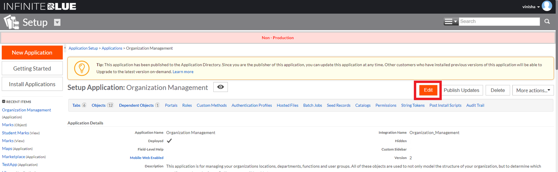
On the Application Settings Page, click Edit.
-
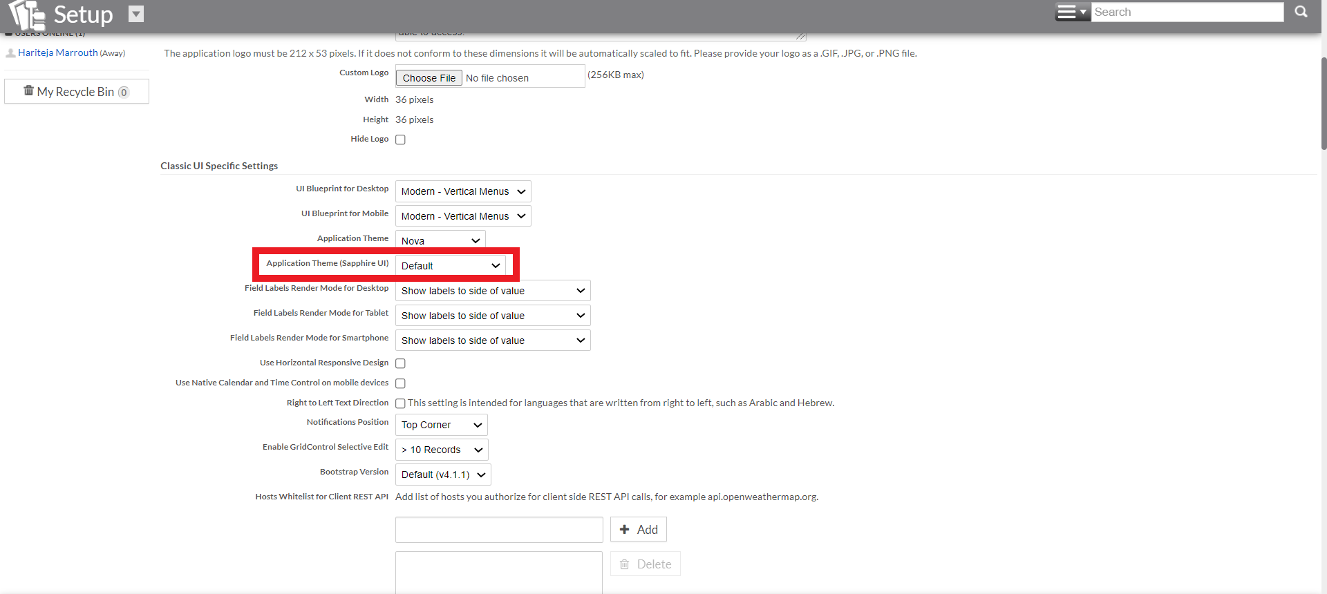
Make the necessary changes in the Classic UI Specific Settings section. You can select the themes available/ created for Sapphire UI in the Application Theme (Sapphire UI) drop-down list.
Note: Since Sapphire UI supports custom themes, these themes also appear in this drop-down list as opposed to Classic UI.
-
Click Save to save the changes.
Note: User preference overrides these app preference settings if any.